.webp)


(The Challenge)
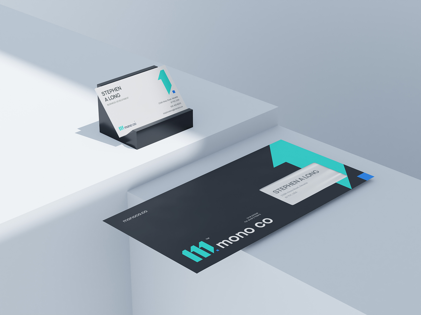
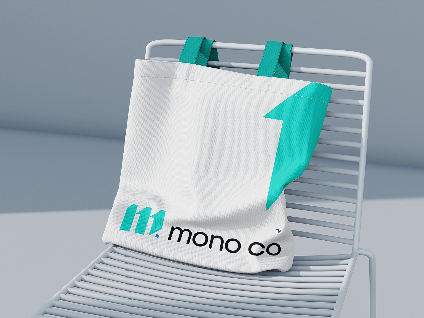
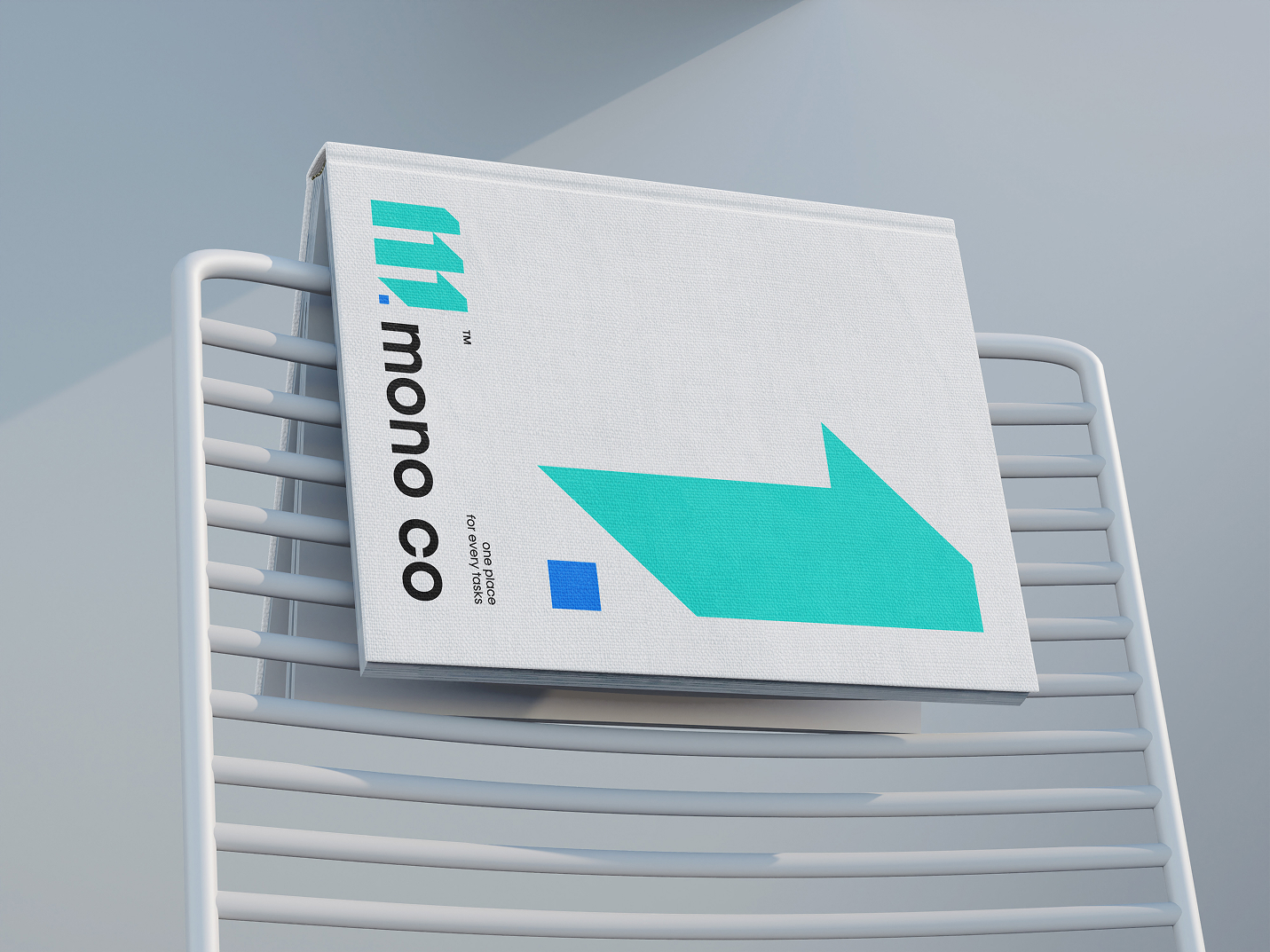
Mono co is a modern task management platform built around one idea: everything in one place. The brand needed to reflect that — unified, minimal, and smart enough to work across a mobile app, web UI, and physical touchpoints without losing its identity.
(The Visual Identity)
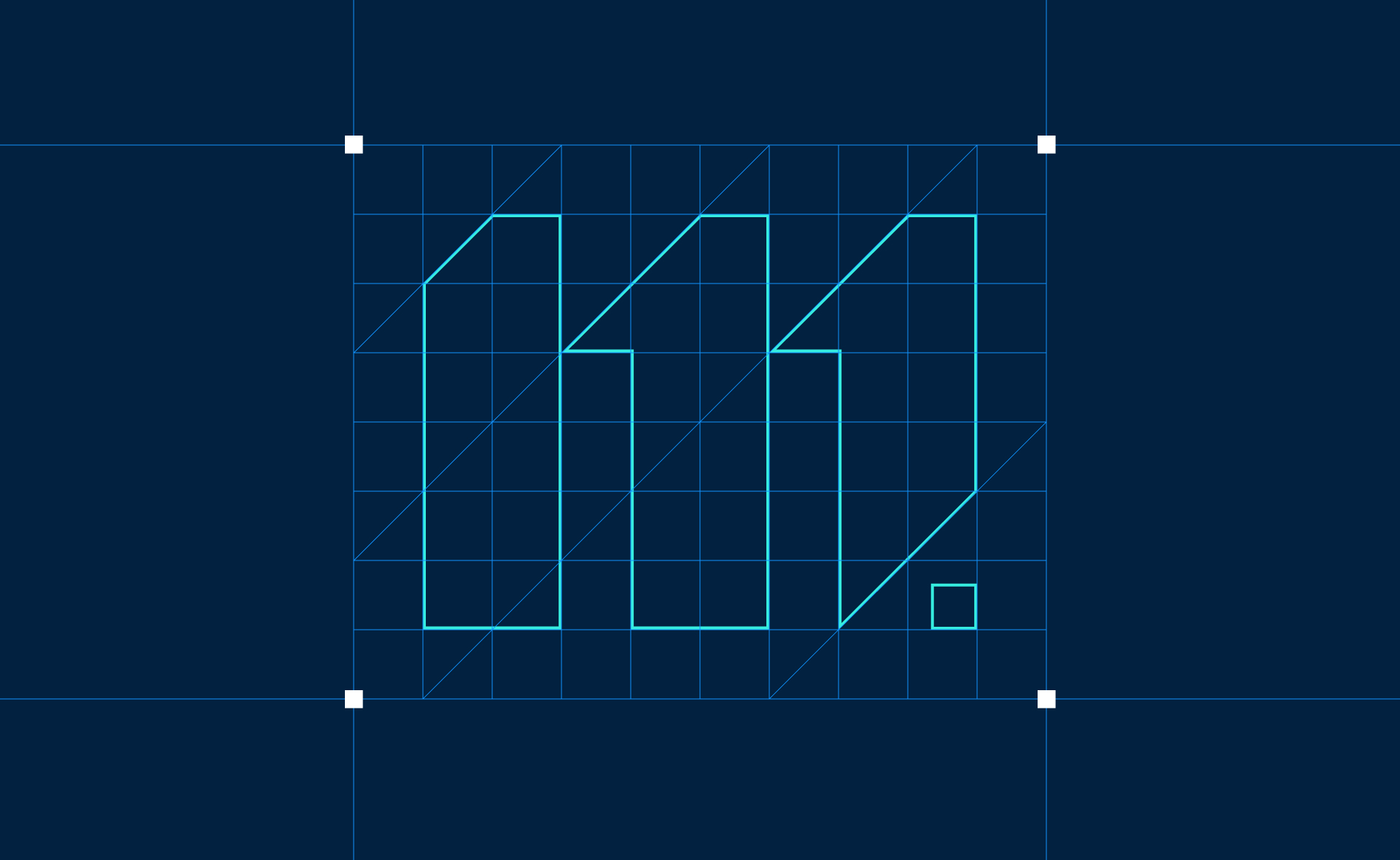
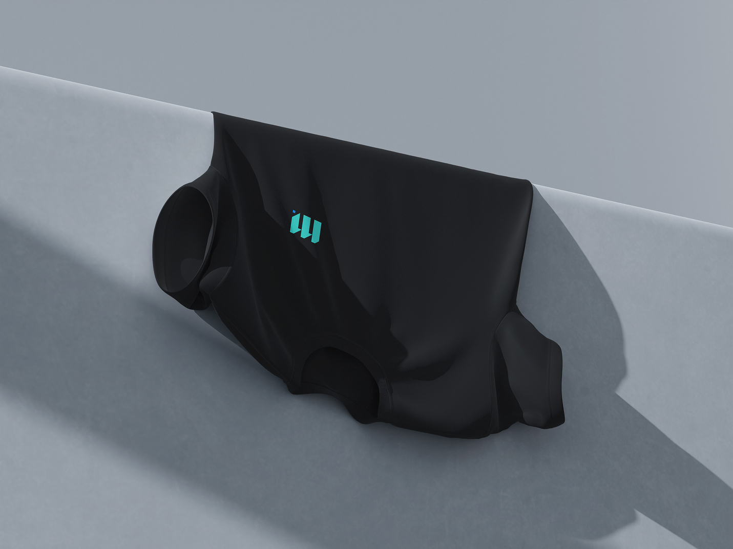
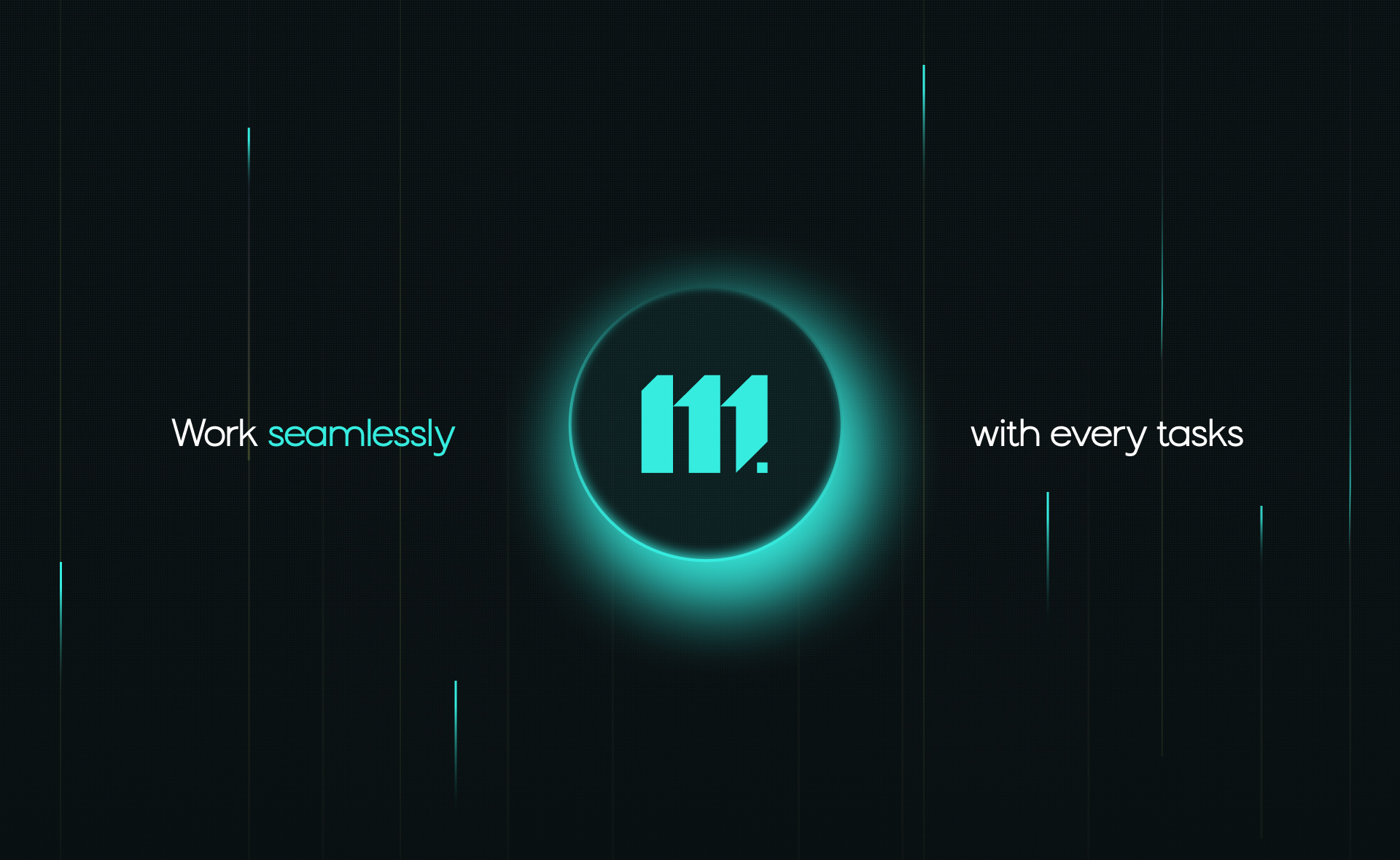
The logomark is derived from three vertical strokes, a typographic abstraction of "111" — representing multiple tasks converging into one platform. The dot adds a terminal quality: decisive, finished, done. It's geometric but not cold. Systematic but not sterile. The palette pairs deep navy with electric cyan, a combination that reads equally well on dark UI, printed stationery, and physical surfaces. The accent cyan is intentionally high-contrast to own attention in an interface without screaming.
(Client)
Mono co
(Data)
(
©
26
)
(Services)
Strategy, Concept



(Final thoughts)
Brand design for SaaS and productivity tools is often an afterthought — shipped after the product, treated as cosmetic. Mono co approached it the other way: the brand was built alongside the product, which means every design decision reinforces both the visual identity and the UX.
(Portfolio 23-26©)