.webp)


(The Challenge)
Every element of this identity was designed to work as a single, unified force - mark, color, and type each carrying the same idea: authority in motion.
(The Visual Identity)
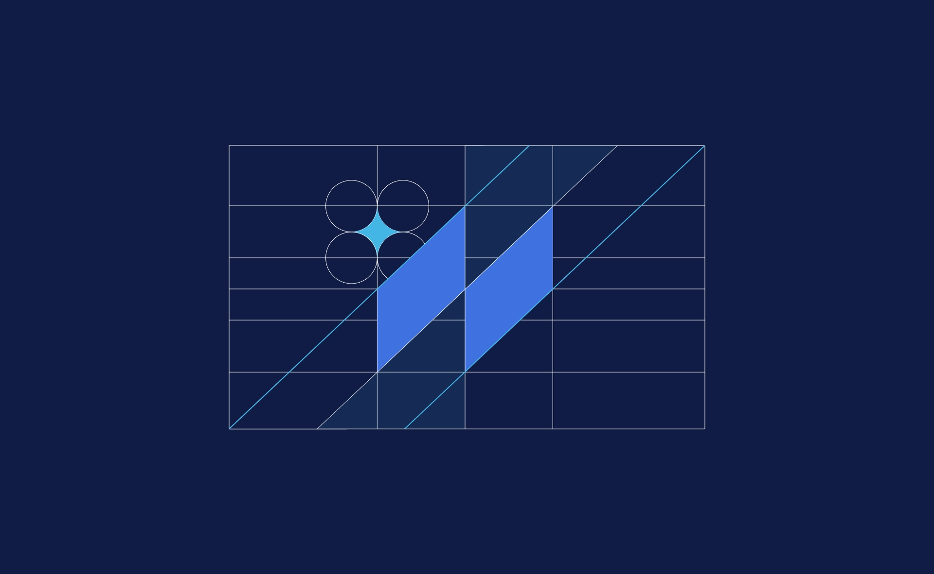
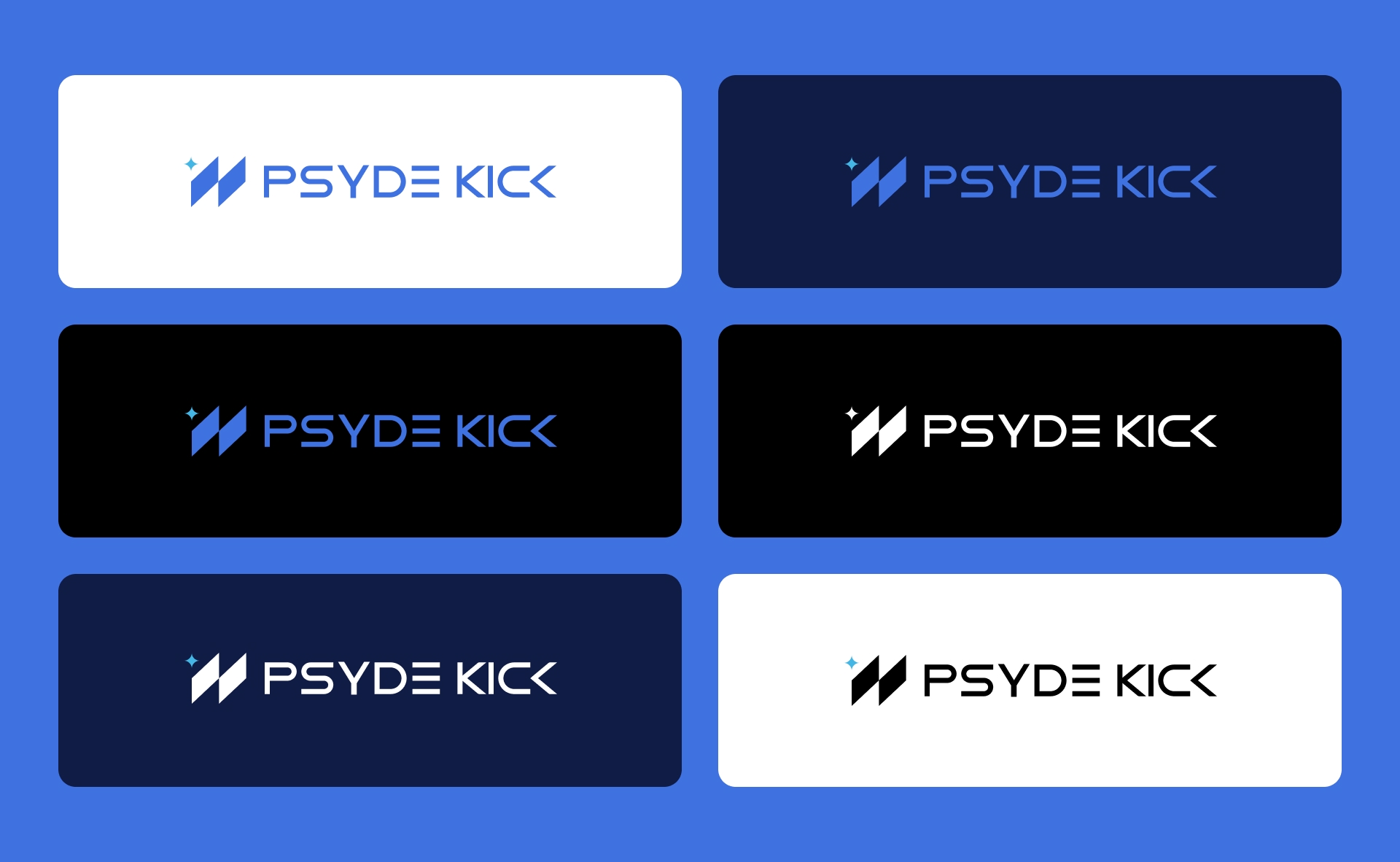
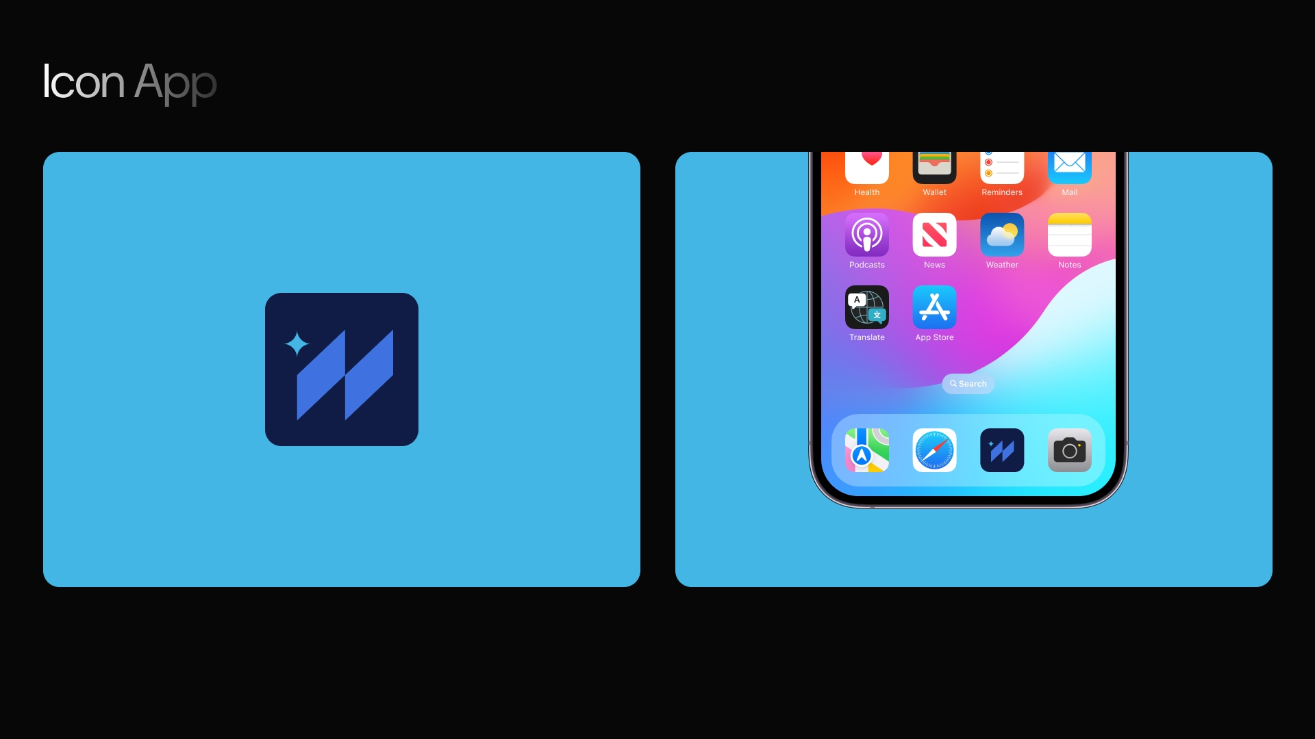
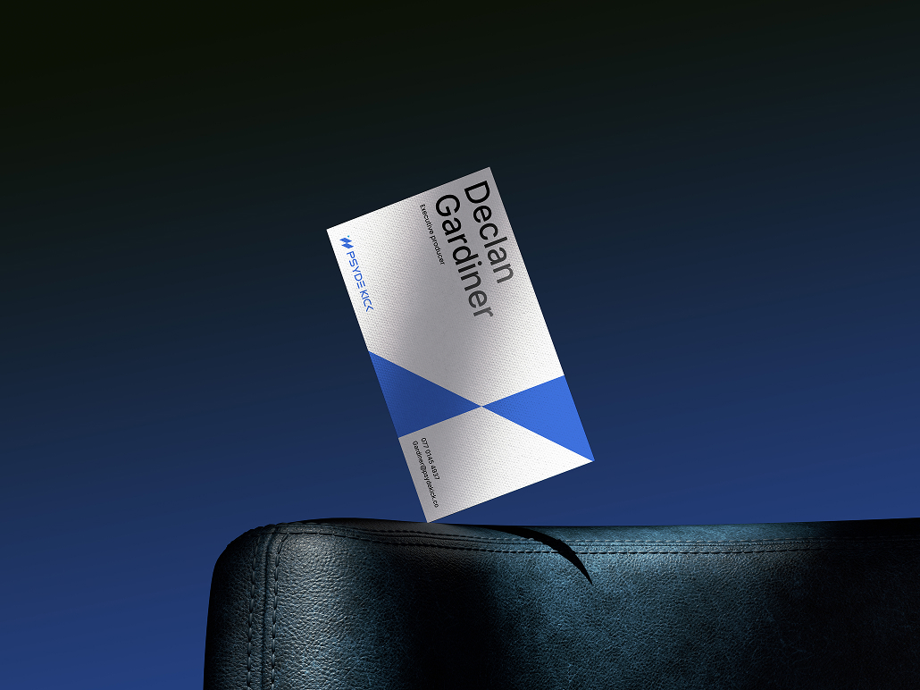
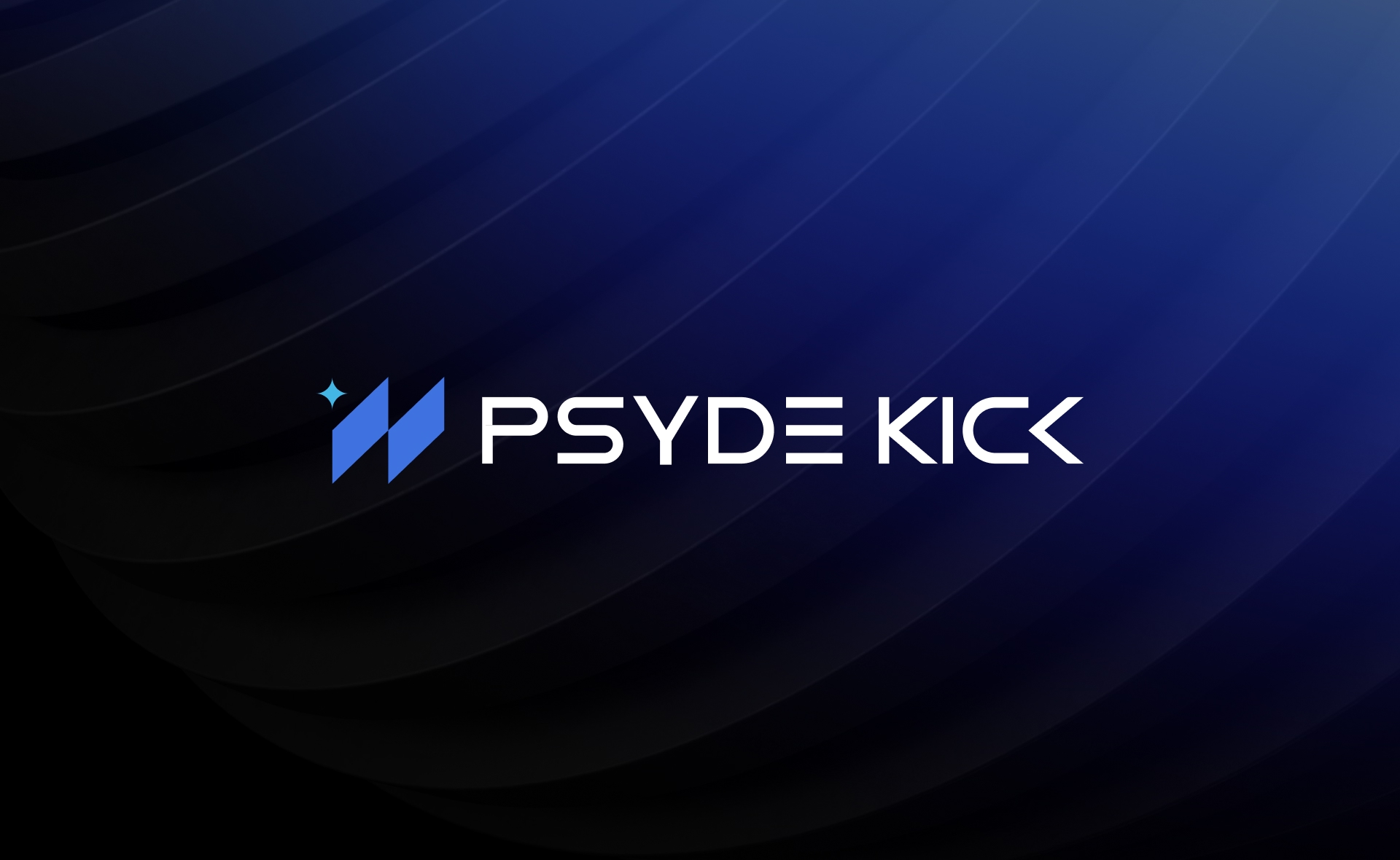
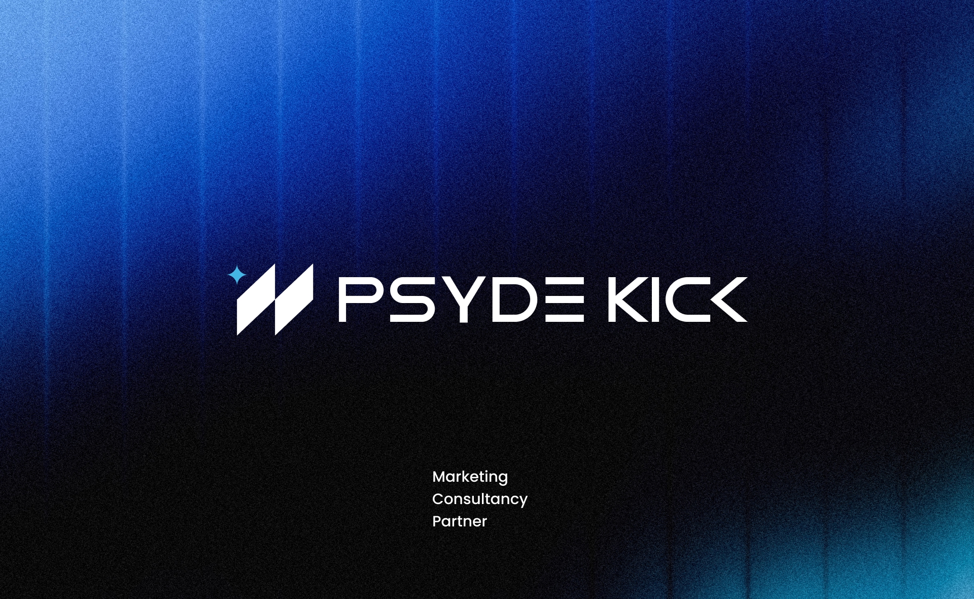
The mark is built from two overlapping angular chevrons with a four-pointed star spark at the intersection. The chevrons read as forward momentum: directional, precise, aggressive in the best sense. The spark is the moment insight lands: the instant strategy clicks into place and the game changes. Together, the geometry forms a tight modular system, grid-derived and intentional at every angle. It holds at favicon size. It commands at billboard scale. Color is deep navy at the foundation: trustworthy, premium, built to anchor dark environments. Electric blue and cyan enter as accent: technology in motion, energy without noise.
(Client)
Marketing Partner
(Data)
(
©
24
)
(Services)
Brand Design, UX/UI Design



(Final thoughts)
Our collaboration with the brand delivered more than just a logo, it established a digital foundation that reflects their bold vision
(Portfolio 23-26©)